RTiK Website Design
Designed a website for a fictional client “RTiK Adventures”.
Role
Lead Designer
Company
University of Washington,
Communication Leadership
Platforms
Desktop web browsers
Areas
Strategy, Branding, Design
Software Used
Figma
Background
The fictitious client, RTiK Adventrues, is a start-up travel agency based in Fairbanks, Alaska focusing on adventures in the Arctic Circle. They are all about one-of-a-kind tailored travel experiences, luxurious accommodations, 5-star meals, and creating unforgettable memories for their customers.
Approach
They do not have a website currently and have come to us to design a concept homepage with additional support pages. They will use these designs to present to their investors, get approval, and then produce the rest of the site and phone app at a later time.

Mood Board
Keeping diversity top of mind for images.
Incorporating brand palette in images and icons.
Beginning to think of navigation structure.
Suggesting new fonts and accent colors.
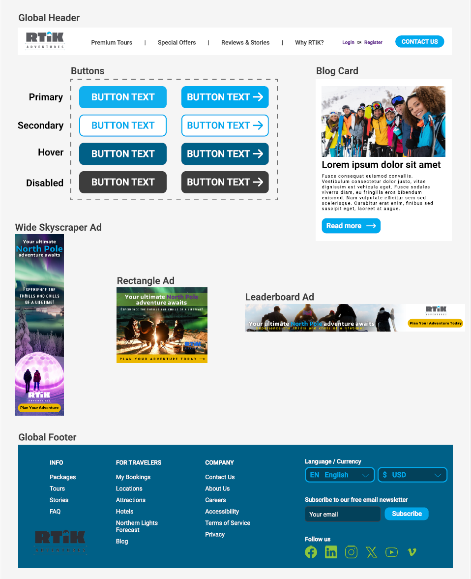
Figma Components and Ad Examples
Built global header and footer.
Created buttons with 4 different states.
Ensuring all designs are consistent with the brand identity.
Designed example ads to show what website promotion could look like.

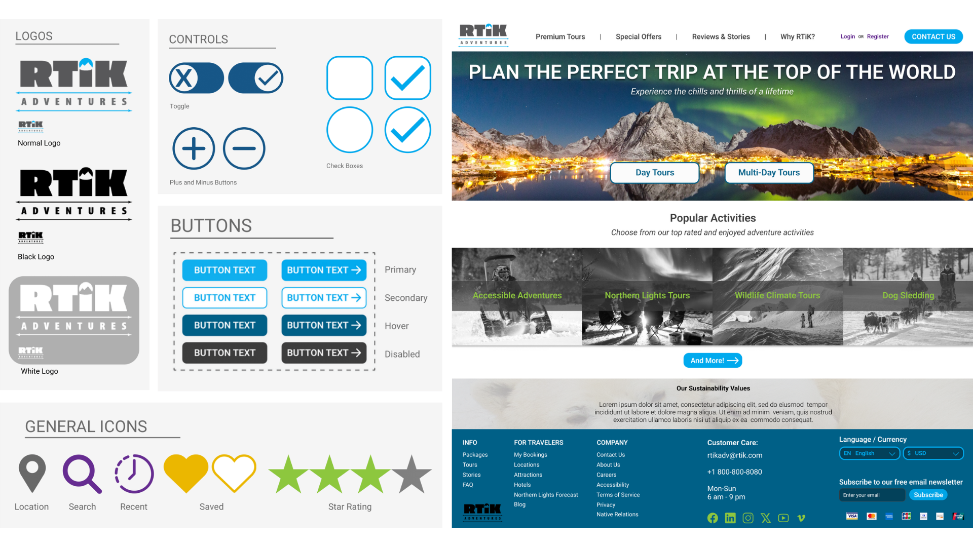
Style Guide
Defined typography, font families and uses.
Expanded provided color palette of primary, secondary, and accent colors.
Designed global interactive elements.
Created styles for icons and controls.
High Fidelity Prototype

Lessons
The main challenge for this project was starting from the basics with limited style guidance and completing a high fidelity prototype within two weeks. This was my first time using Figma and I wanted to deliver a product of high quality that functioned as expected before the deadline. I wanted to ensure that there was enough information being presented on a given page while not overcrowding the visuals or text. I am still actively working on this project in my free time to improve it's design and accessibility.
Future Changes
Include a search bar in the global header.
Limit use of colors to fit a more luxury and high-end experience.
Continue to work on accessibility with functions and colors.